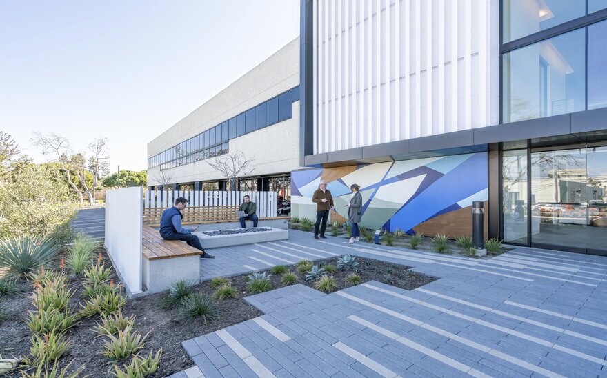
While accommodating multiple tenants in a single office building is not uncommon, giving up to six of them distinct entrances and private terraces is indeed unique.
In Southern California, architecture firm Ware Malcomb renovated a two-story 84,000-square-foot office building located at 1940 E. Mariposa Ave. in El Segundo. This “tilt-up” structure — built using a construction method that makes use of concrete panels — was previously occupied by a single tenant. For the redesign, Ware Malcomb infused flexibility into the property redesign, so the building could be adapted for occupancy by one or multiple tenants.
A Modern Vision
Sergio Valentini, principal of Ware Malcomb’s Los Angeles office and the lead architect on the project, considers project owner Montana Avenue Capital Partners to be a pioneer in the repositioning of assets into creative office space. Their business model has been to acquire assets in good locations that can be upgraded, converted and stabilized.
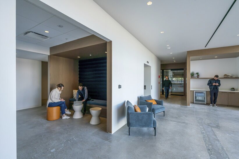
In this case, Valentini said they bought an underperforming building that was completed 40 years ago. Some renovation was done by the building's single tenant before they bought it, but it hadn’t been brought up to contemporary office standards. The goal then became to add amenities and create a modern feel.
This objective was accomplished by providing connectivity to the outdoor spaces; creating direct and dedicated access to tenant suites; upgrading the finishes; and introducing amenities including lounge seating, a grab-and-go coffee bar, a game room, exterior collaboration spaces, foldable doors for indoor-outdoor connectivity and electric vehicle chargers.

Creating a Flexible Design
“We work really hard to build an access strategy into our designs [for office], so [they can] work well as either single- or multi-tenant buildings,” said Valentini. He added that for Mariposa, they evaluated concepts for a single tenant, but also studied designing spaces for up to eight tenants.
Ware Malcomb typically agrees on a concept with the client, establishing minimum and maximum size suites. If existing walls need to be torn down, they work to ensure that each remaining space is still functional, attractive, well-lit and accessible to the building amenities.
With a floorplate resembling a classic rectangle, the building historically had a single access point in the middle of the long, north-facing wall, adjacent to the surface parking lot. The architects renovated the existing main entrance and the building core, created a back lobby on the south side, and added an exterior staircase on the east side of the building providing access to the second floor.
Each of these three areas could later be modified to provide private access and patio space for three more tenants. Other configurations could also be created to accommodate more than six tenants in the building.
“It's very important [in a multi-tenant] scenario that each tenant retain a sense of arrival in a private entrance. People like to feel like ‘it's my office.’ That's always been true, but I think especially after COVID [19],” some tenants prefer not to share things like lobbies and elevators, so dedicated access is a real value add, Valentini said.

Outdoor Spaces
The architects also took care for where they placed the exterior doors and exterior terraces, so that if the floors are split, most tenants can still get their own private outdoor space. Before the pandemic, Valentini said the firm needed to push clients to focus on creating outdoor spaces. But “during and after the pandemic, our lives got a little easier, because clients realized they need it and now they ask us for it.”
The outdoor spaces were a real bonus to the project, Valentini said, because before the renovation there was nothing there except a parking lot. “We created some common area terraces on the west side of the building, at the main entrance, and in the back … we ended up building two private patio spaces.” He added that they planned to have up to six private spaces so there's a possibility in the future to retrofit some of the outdoor terraces with tenant improvement allowances.
To create more access and connectivity between the indoor and outdoor spaces, they added a few sliding doors and more operable doors creating opportunities for collaboration outside and connectivity with nature. These are things that benefit wellbeing, increase productivity and generally attract tenants because they are appealing to employees, Valentini said.
The addition of outdoor spaces “was a huge transformation for the building,” Valentini said, and that they’re the element that will probably contribute most toward winning over tenants.

Tilt-Up Can Appeal to 'Creative' Tenants
The tilt-up construction technique involves casting concrete wall panels, either on or off site, and then lifting them into place to assemble the building. The technique used to be common for both office and industrial properties, for buildings not exceeding four stories, Valentini said. He added that today,the assembly type is more prevalent for industrial buildings and the techniquetends to be more common in low-density settings where there is room to stage and erect the panels.
“But the benefit, besides the construction time savings, is … the cost savings when you combine the structure and the enclosure in one piece,” Valentini said.
Over the past 10 years or so, tilt-up buildings, whether categorized as industrial or office, have been sought after by investors interested in leveraging their warehouse feel and converting them into “creative” office space that appeals to designers, technologists, artists and other inventive professionals.
Part of the attraction is that buildings with structural elements along the perimeter “have minimal columns, no lateral braces, no shear walls, or X bracing in the building,” Valentini said. Those conditions generate tremendous flexibility in building out interior spaces and allow for large open-plan designs.

Additionally, “a lot of these buildings have wood framing for the floors and the roofs, so there is an exposed look with the open ceilings, something that is sought after in the office market,” Valentini said.
However, one of the challenges of having a structural wall linked to the perimeter of a building is that you may not be able to have as many openings as you would like, making this construction type less appropriate “if you're trying to achieve transparency or visual connectivity with the exterior,” Valentini noted.
Renovating a tilt-up structure can present challenges “because anything you want to do on the exterior perimeter you're doing to the structural wall, so you have less flexibility in cutting openings.” Openings can be punched, but they need to be reinforced, triggering reevaluation of the lateral system which is expensive.
It can be done but “you need to think carefully about what you will do and where you will put your money.” He advised to be aware of the existing structure, work within the constraints and know that it will be challenging and costly to cut openings. Valentini emphasized, “make sure when you cut an opening in the wall … it benefits the project.”

Environmental Sustainability
Today, many commercial real estate professionals recognize that the greenest buildings are the ones already built, increasing the appeal of structures that can be reused and renovated, cost effectively. In this vein, a full 80% of the original Mariposa building was retained.
Sustainability is a key goal for Ware Malcomb as a firm and it is also a priority for Montana Avenue Capital Partners. It was especially relevant in this project because one of their capital providers is European. “In Europe, you are required to invest in sustainable practices, so it was a good match for everybody,” Valentini said.
At Mariposa, they were able to reuse the overall mechanical system, though they did replace elements that were no longer compliant or at the end of their life cycle. “We added controllers that improved the efficiency of the system and allowed us to meter differently in order to keep track of the energy used by the cooling system,” he added.
The restrooms were completely renovated and upgraded with water-saving fixtures. For the landscape, drought-tolerant local plants were added.
Metering was changed in this building because Montana is now tracking energy and water consumption in all of their buildings to measure the savings users are actually achieving after improvements are made, Valentini indicated. “Sometimes it's easy to say we did all these things, but if you don't go back and check how buildings perform, you cannot learn the lessons and how to do it a bit better.”
